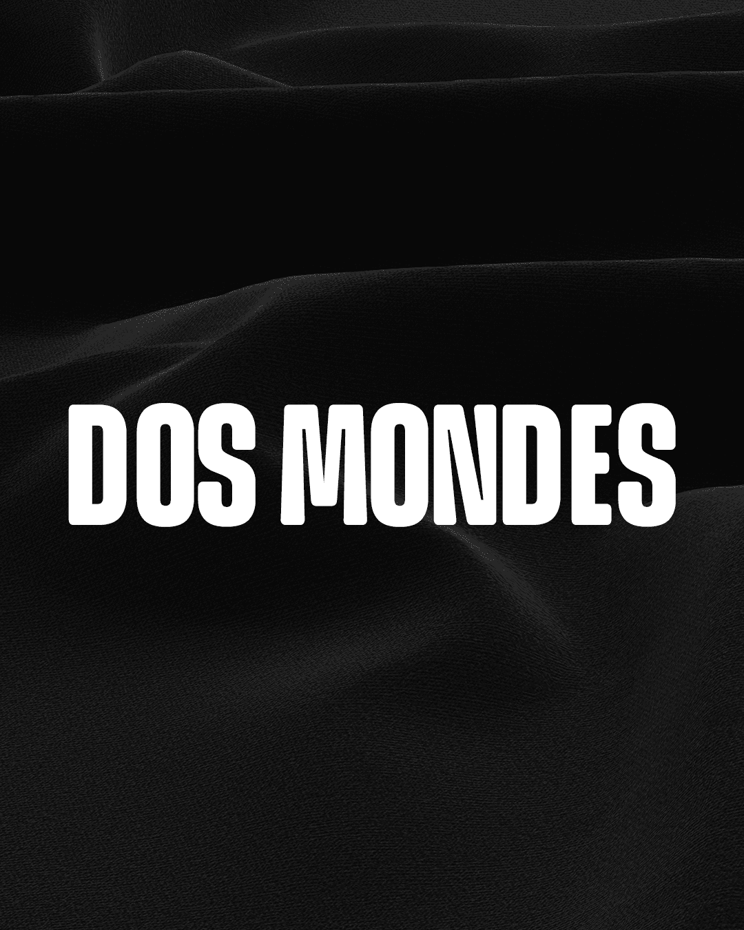
DOS MONDES.

Dos Mondes.
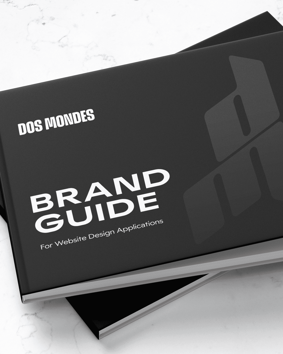
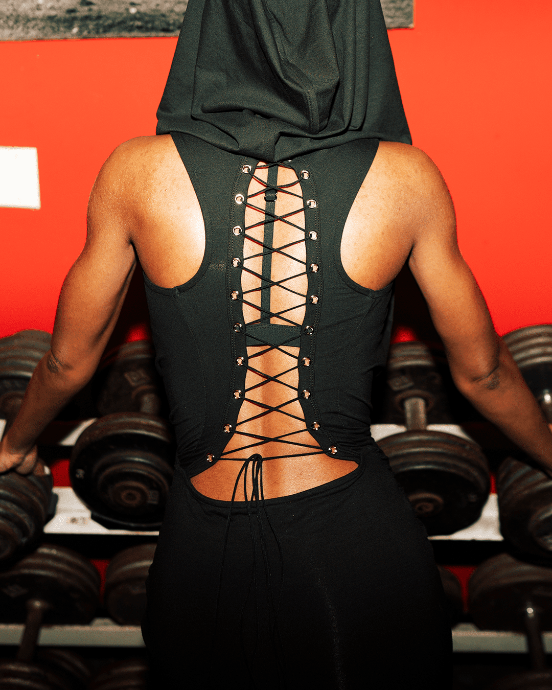
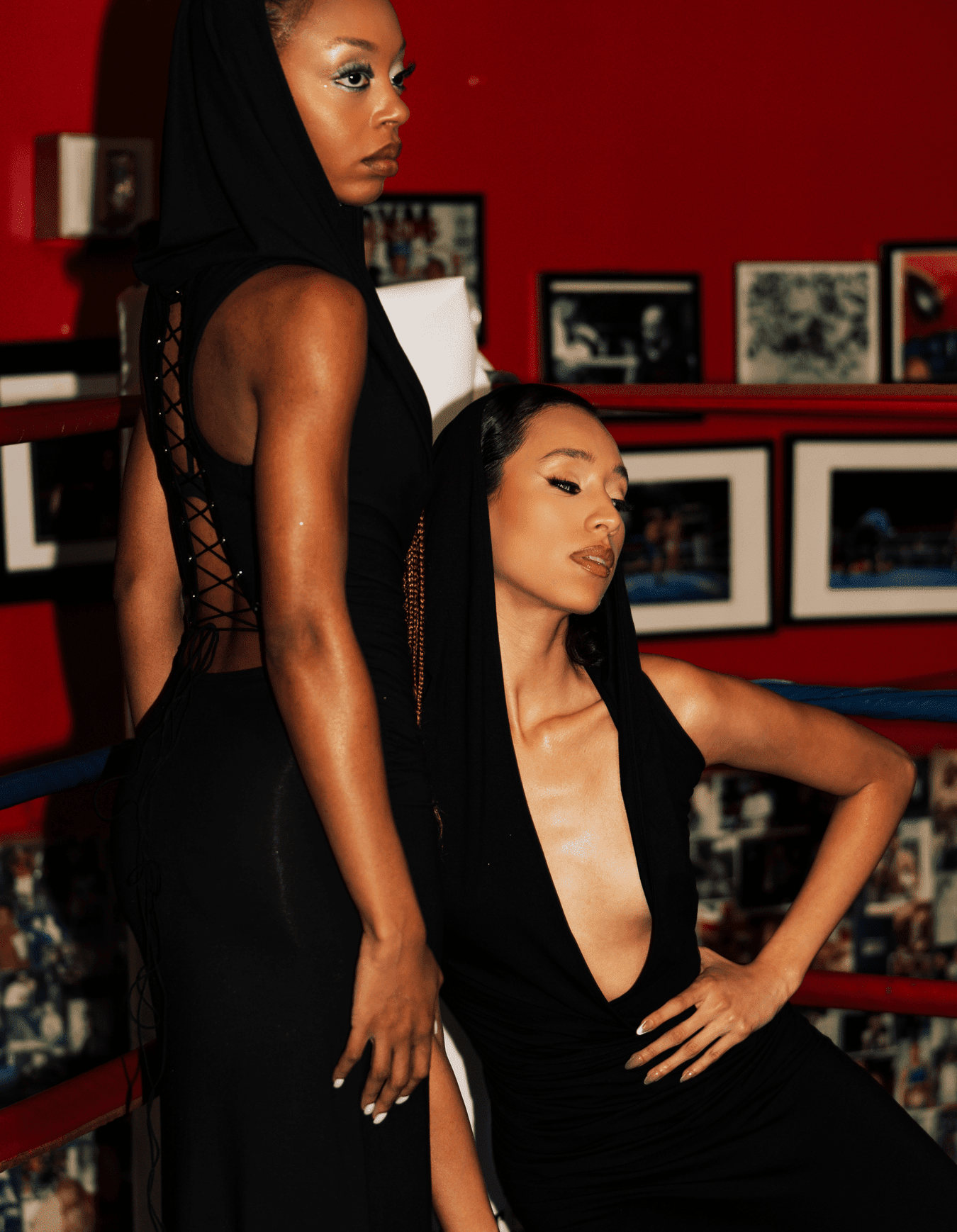
For Dos Mondes, a fashion brand of elegance and modern femininity, we enhanced its presence with refined branding, an intuitive UX/UI website, and a custom typeface for a distinctive, cohesive voice.
OVERVIEW
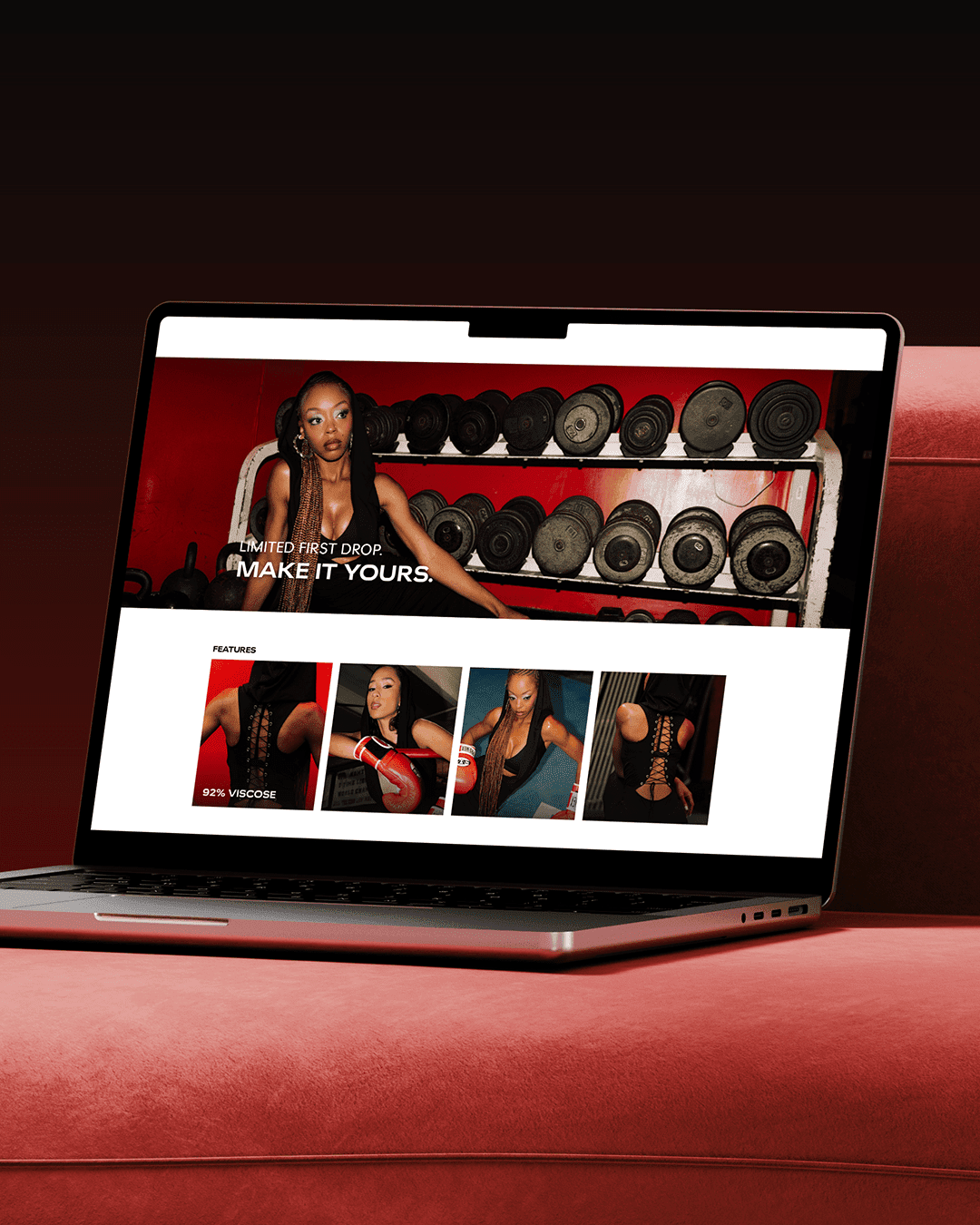
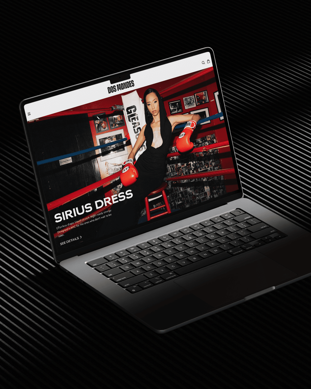
Dos Mondes brings together timeless style and contemporary expression. We translated this philosophy into a clean, immersive website with a strong visual system and refined typography, prioritising clarity and intuitive user experience to seamlessly guide users through the brand story and collections.
Services Provided.
➣ Visual branding refinement
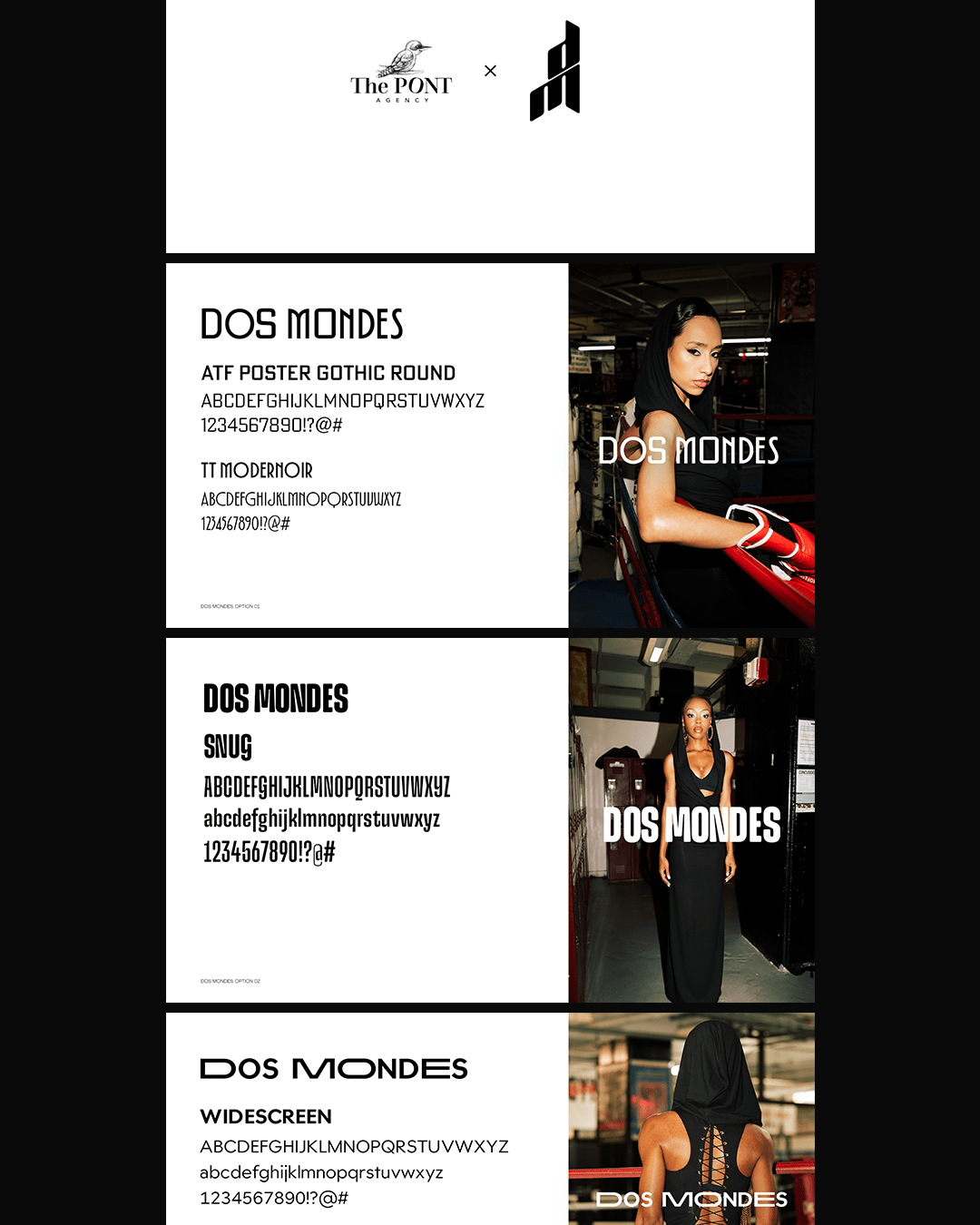
➣ Custom font design (bespoke typeface for Dos Mondes)
➣ Website design with a strong UX/UI focus
➣ Digital design and layout systems
➣ Typography and visual hierarchy development
➣ Brand consistency across digital touchpoints
➣ Custom font design (bespoke typeface for Dos Mondes)
➣ Website design with a strong UX/UI focus
➣ Digital design and layout systems
➣ Typography and visual hierarchy development
➣ Brand consistency across digital touchpoints
Strategy Applied.
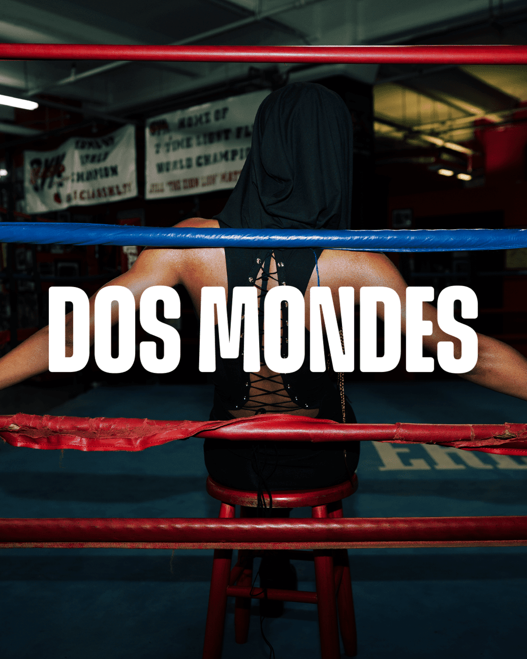
Visual Branding: We built upon Dos Mondes’ existing logo by developing a cohesive visual language that enhances its sophistication and versatility.
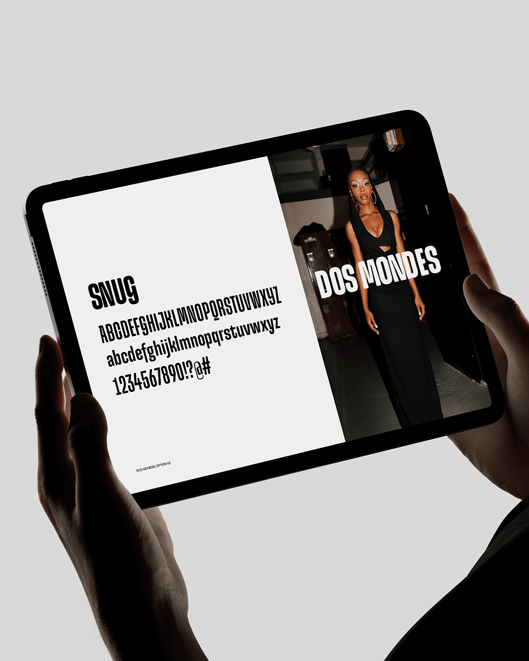
Custom Typography: A bespoke font was designed exclusively for Dos Mondes, giving the brand a unique typographic identity that reinforces its refined, fashion-forward positioning.
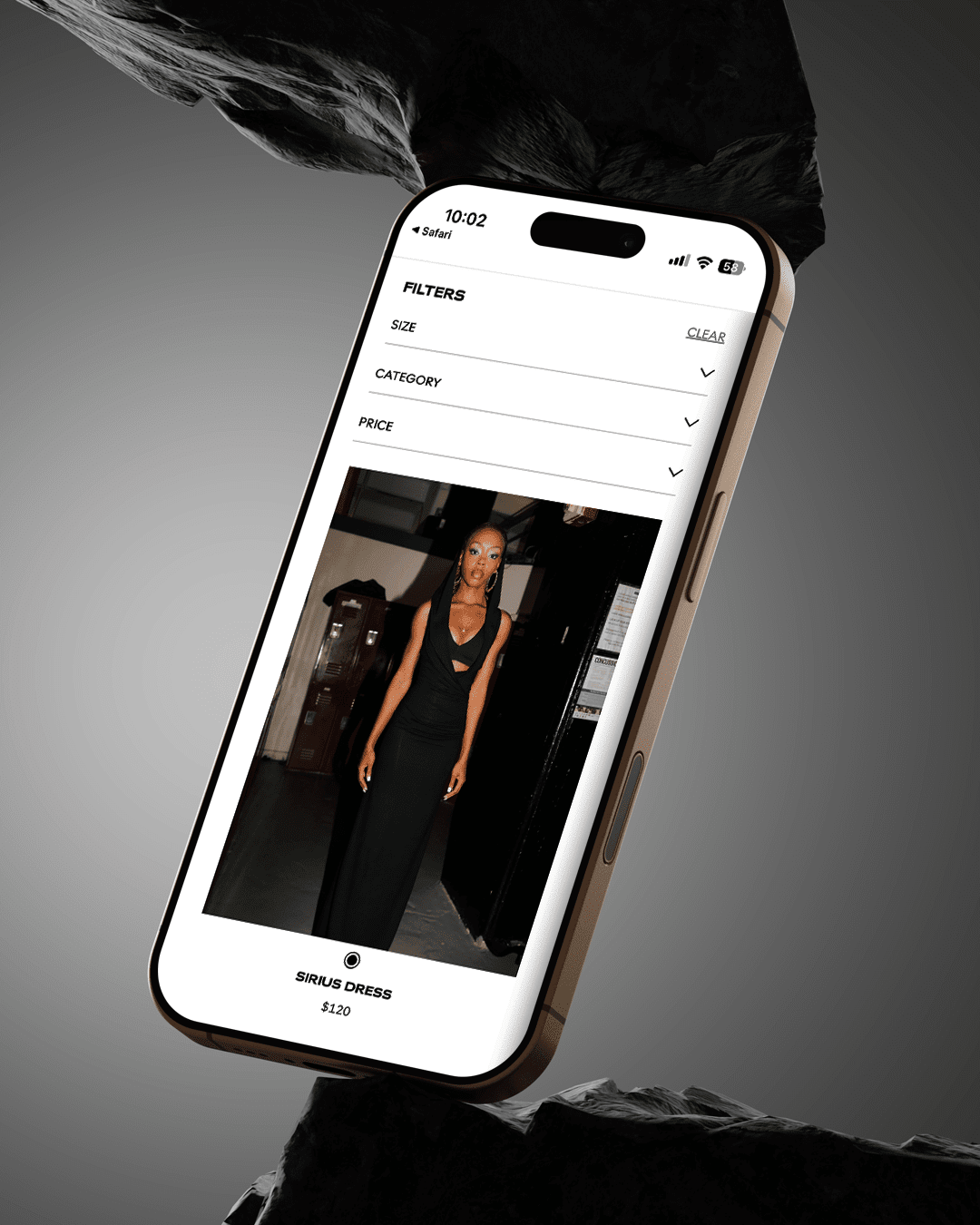
Design Cohesion & Brand Consistency: The website was designed with a strong focus on user experience, balancing editorial elegance with intuitive navigation to create a seamless, elevated browsing journey.
Design Consistency: Every element, from spacing to typography and layout, was carefully considered to ensure a consistent and polished brand experience across the site.
Custom Typography: A bespoke font was designed exclusively for Dos Mondes, giving the brand a unique typographic identity that reinforces its refined, fashion-forward positioning.
Design Cohesion & Brand Consistency: The website was designed with a strong focus on user experience, balancing editorial elegance with intuitive navigation to create a seamless, elevated browsing journey.
Design Consistency: Every element, from spacing to typography and layout, was carefully considered to ensure a consistent and polished brand experience across the site.